I should say this is the last photo. Because it's 4 of the same one. Or 8 of the same one. If you click on the 4.
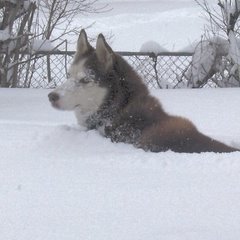
 "No-dinking" photo |
 Dinking 40's worth |
 Dinking 60's worth |
 Dinking 80's worth |
Anyway. This is a picture of Lucy in snow. Photos like this one have a problem. Lucy is black. Snow is white. That's a big contrast!
Cameras and computers can't see contrast as well as humans. So a human sees a scene like this and wants to take a picture. But the picture turns out crummy and the human is disappointed. Or so the Human Assistant says.
He tried fixing Lucy's picture four different ways using a computer program for fooling around with pictures called the GIMP. (Which is perfect for H.A. because has a bad leg. Heh.)
GIMP comes in a version for Win Doze. Also in a version for Mac-aroonie.
But we are usually in Debian. Which is a type of Linux - GNU mishmash. So we (okay, he) has one of the versions of the GIMP for unix-like systems.
Anyway. In the first copy of the photo he didn't adjust brightness or contrast. Details in the snow are nice and visible. But details on Lucy aren't.
(By the way. The caption says "No-dinking." That's a fib! He did increase sharpness. Just not brightness or contrast.)
In the second copy he added 40 points of brightness and contrast. Then 60. Then 80. And now details on Lucy are pretty good. But details in the snow aren't.
Which do you prefer? Let us know! ... No-dink ... 40 ... 60 ... 80 ... or ... None of the above!
...
By the way. The H.A. had to go back and change two of the captions on Sunday's post.
"Going down the hill" and "Coming up the hill"? They should have been "Going across the top of the hill" and "Near the house, away from the hill." But H.A. was so intent on making it look like I have to struggle up the hill because of my weight that his mind just sorta blocked out the real locations of those pictures.
I wasn't happy about that! So he went back and looked at the whole pictures. Before he put crops on them. And he agreed to change the captions.
That's all for now. Be sure to vote, all you art-critic member of the jury!
ⓣⓤⓒⓚⓔⓡ
5 comments:
The 40. The 60 and 80 don't have enough sharpness.
Our great-brother Booter was mostly black, too. Mom said he was totally handsome, but very hard to photograph!
Luv,
Dave - Guide Dog for the Color Blind
80. I like being able to see a doggie's pretty face and eyes, and phooey on the background if it gets a little messed up!
I like the 40, because you can see most of Lucy's features, and yet still see the snow.
I miss snow...
diane
We like 40. It gets an even balance of everything!
Woos,
Thor
Mom downloaded the GIMP software to her computer a little while ago but still has not had time to learn how to use it!
Woo woo, KA
Post a Comment